Salon Effects Magazine Ad!
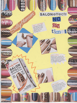
In this assignment the class was instructed to create a magazine ad made of cut-outs from magazines. We knew we had to use 4 elements of design in this project. We had to use line, emphasis, color, and balance.
We used magazines, markers, scissors, colored pencils, glue, and construction paper. The research that we were allowed, was to look through different magazines and pick out pages and cut-out information that we would want to use in our ads.
The steps I used to complete my ad were:
1. Gather magazines
2. Find a topic that I wanted to make an ad about (nails)
3. Cut out pictures & words that would fit in my ad
4. Find the perfect background color that stands out (yellow)
5. Layout the pictures & see what fits where
6. Glue on the pictures
7. Make the final touches (adding the "Emphasis" to the nail box)
I really liked my final product. It came out just the way I wanted it. I have pictures of painted nails as the border around the whole ad with the steps of how to apply the product in the center. For the element, LINE, I cut out letters and words and slanted them on page to have the reader's eyes read the name of the product and familiarize themselves with the product. For the element, EMPHASIS, I used an orange marker around the nail box to bring out the product. For the element, COLOR, i used colors that would match together and keep the reader focused on the product being advertised. Lastly, for the element, BALANCE, I used the nails as a border to keep the design stable. I used radial balance, which is having the main focus in a center point. The border brings the focus into the center of the ad which explains the product in depth.
During this project I had feedback from peers and myself. When I chose the background for my ad I had chose a blue background originally. When I started arranging my ad I realized I needed a different color to blance it out. I then chose the yellow background and I felt much better with the way the colors were flowing. Some of my peers were amazed when they saw my ad. They really liked it and could tell the amount of effort I put into this ad.
I learned alot from this ad. First, I learned four important elements of design and how they can affect the way someone looks at things. I also learned that feedback is good to receive so you know how other people feel and what they would do to help you improve some thing through a different perspective.
If I were to do this project again I would change the product. I would use a different product and compare to see which used the elements of design the best.
With some minor and fixable mistakes I was able to create the perfect ad for me that i was very proud of in the end! :)
Halloween Flyer!
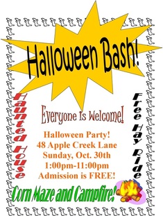
For this project we were instructed to create a flyer with whatever event we chose. This flyer is showing a Halloween Party that everyone is invited to. There is a Hay Ride, Corn maze, Haunted house, and a Campfire. Admission for this party is free. I started by adding a ghost boarder. I then made an explosion bubble and wrote the title with Word-Art. Mr. Adams had given us some tips on using publisher before we started this project. I added a picture to attract the reader's eyes to the flyer. Putting a lot of effort into a project defintely pays off. I was happy with this flyer. I also made the Honey Pot Hill flyer down below. :) Enjoy!
Honey Pot Hill Flyer!
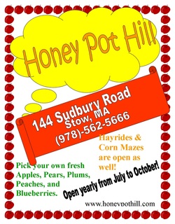
For the Honey Pot Hill flyer I was informing people that there is a nice place around them to spend time with their families and pick some fruit! Honey Pot Hill is in Stow, MA, and has a lot to offer. They have hayrides, corn mazes, and a cute farm where you can feed the pigs, chicken, and many more great animals!
I did get feedback once again while doing this. Peers helped decide on certain colors and if they liked what the flyer was turning out to be step by step.
With this project I definitetly learned a lot. I had never really used publisher before and it was fun seeing and being able to use all the resources they had to offer.
As an additional exercise, we were asked to "2 up" the flyer. This meant we put two flyers on one sheet of paper to save paper. We had to resize the flyer and make them fit on a sheet of paper. I enjoyed my end products :). Hope you do enjoy as well.
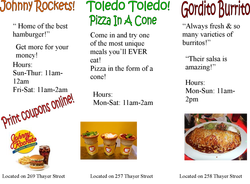
Thayer Street Brochure!
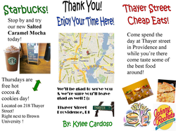
For this assigmnet we took a field trip to Thayer Street in Providence. I wasn't able to go but I got information of "cheap eats" from my group. I used Starbucks, Johnny Rockets, Toledo Toledo Pizza In A Cone, and Gordito Burrito. For each restaurant I wrote a little bit about what they have to offer and I put the store hours. I also included some pictures and quotes people said about each of the restaurants. Even though I wasn't able to go I completed the assignment and got enough information to be satisfied :). I was proud of my finished product. The inside of the brochure is down below.
Thayer Street Brochure Back